

Apple: Controversial Liquid Glass UI receives well-known design award
Hardly any change in recent years at Apple was as controversial as its operating system redesign. Nevertheless, Liquid Glass has now received a well-known award.
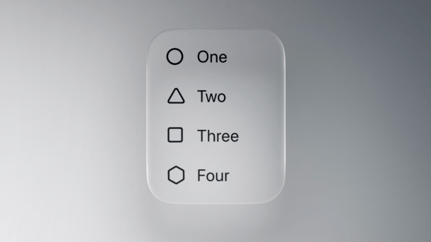
Liquid Glass (here in a video for developers): User reaction extremely mixed.
(Image: Apple)
Even though users complain about it and even the responsible chief designer has now left Apple for Meta: The new Liquid Glass UI will likely remain on iPhone, iPad, Mac, Apple Watch, and Apple TV (plus Vision Pro) in the coming years. While Apple is planning further refinements, especially under macOS, according to insiders, the basic design will probably not be touched. The iPhone manufacturer has now received positive feedback: Liquid Glass received a so-called Gold Cube from the renowned Art Directors Club of New York, which brings together well-known designers and advertising experts. The award was decided by a total of 13 judges.
Apple praises itself
In addition to Liquid Glass, Apple also received awards for five other projects, including the new Apple TV branding without “+” and for the direction of a commercial with actor Pedro Pascal. However, the UI “win” received the most attention because the look is so controversial. Apple itself, however, continues to stand by it. In the application, it states that with “refined typography, expressive iconography, considered materials, and cohesive colors,” they have created a user experience that works “coherent across every surface.”
Videos by heise
The Art Directors Club of New York apparently saw it the same way, even if Liquid Glass is still criticized for readability issues, among other things. However, the Gold Cube is not the highest award from the New York designers' association; it is officially only the second rank. In its application, Apple emphasized that the team had succeeded in updating the design “across all our platforms” and integrating it “deeply into the system as well as into the apps.”
Transparent and not very coherent
The ongoing criticism of Liquid Glass is mainly due to a lack of coherence, especially under macOS, where elements of the new UI clash with the older design. In addition, there are many transparent areas that confuse older eyes in particular.
Initially, biting criticism stated that the system's visual orientation was similar to Windows Vista. Meanwhile, however, many users have become accustomed to it, especially under iOS. Apple reduced the effects from version to version.
Empfohlener redaktioneller Inhalt
Mit Ihrer Zustimmung wird hier ein externer Preisvergleich (heise Preisvergleich) geladen.
Ich bin damit einverstanden, dass mir externe Inhalte angezeigt werden. Damit können personenbezogene Daten an Drittplattformen (heise Preisvergleich) übermittelt werden. Mehr dazu in unserer Datenschutzerklärung.


(bsc)
